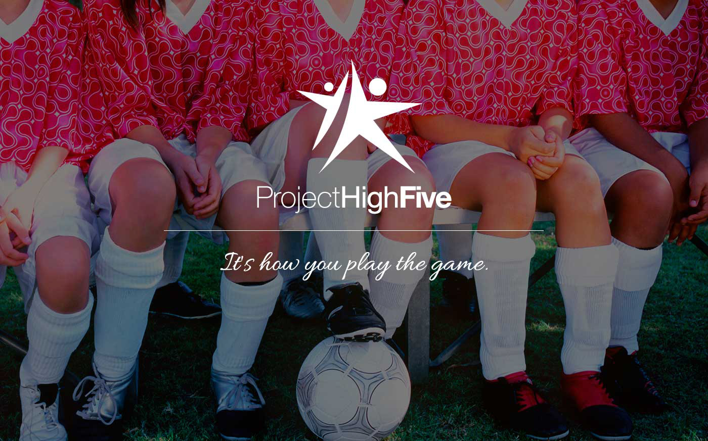
Project Play Smart was just getting started, and already needed a new name. Another youth sports-related organization had a similar name, and were (politely) suggesting that a change was in order. So we were starting from scratch: a name, domain, logo, colors, and visual style.
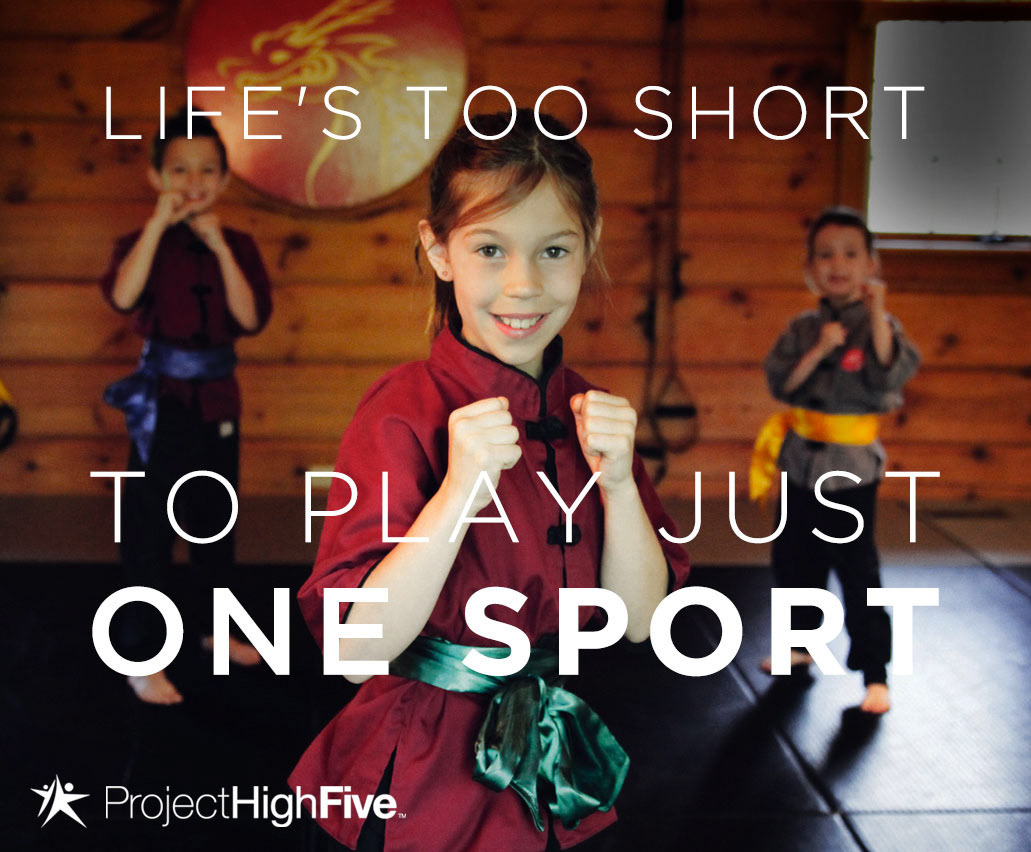
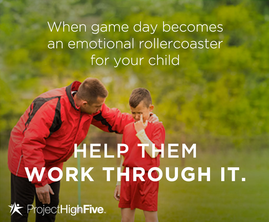
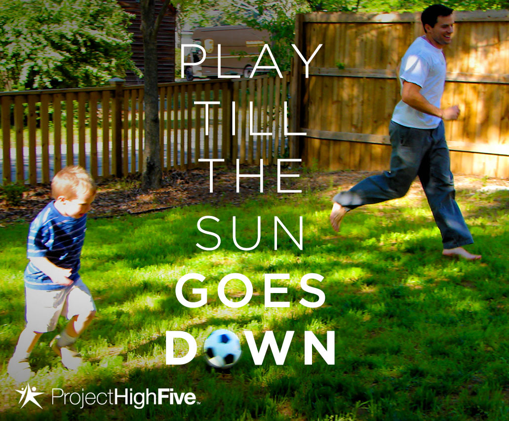
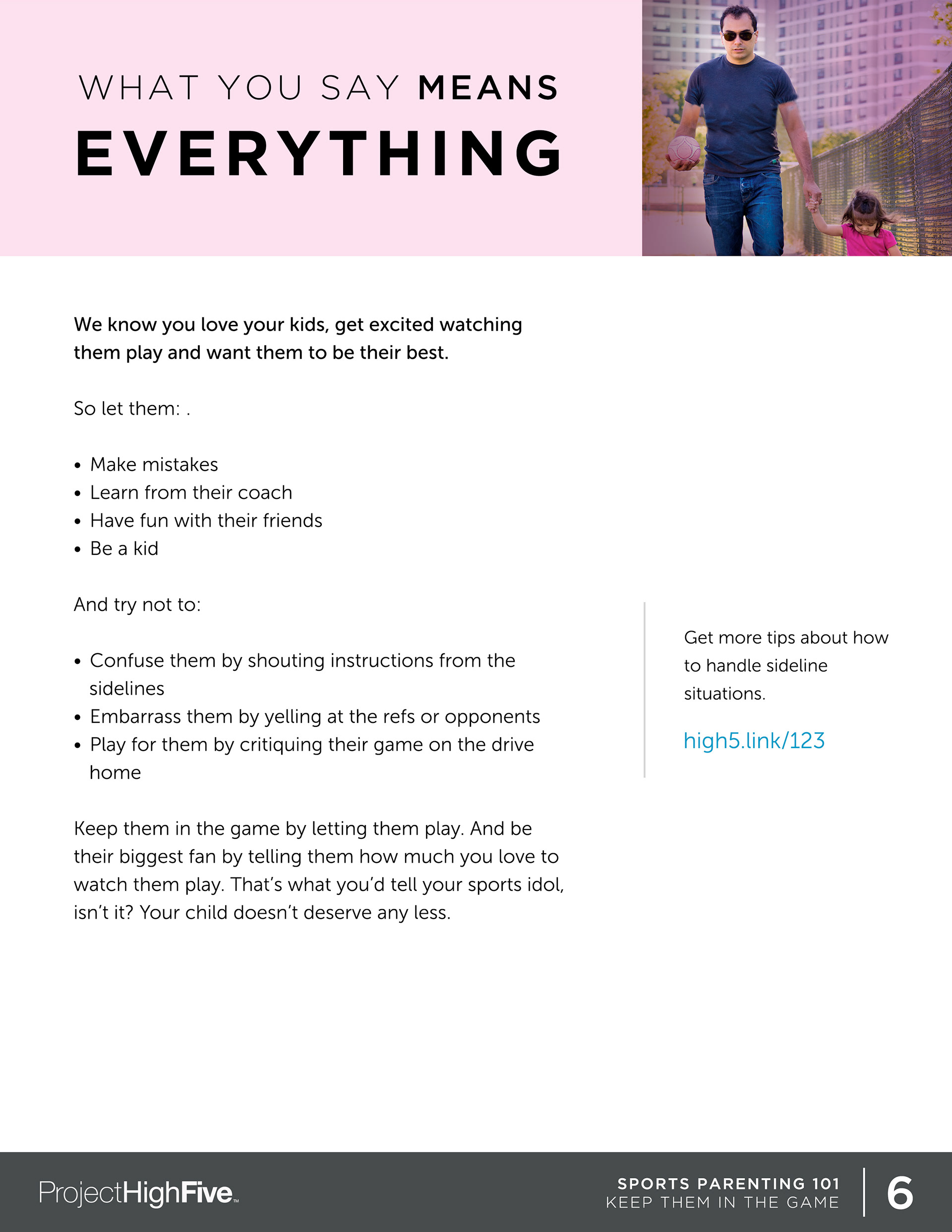
The organization's primary goal — to improve the youth sports experience in America, with a focus on keeping kids participating — could inspire the design. The core concept came from one of the organization's basic tenets: don't criticize, just offer support. Simply put, a high five.
The icon needed to evoke action, positivity, and fun. And the action of performing a high five seemed to be the perfect starting point. Morphing the design into a shooting star worked visually and emotionally, illustrating the growth of the children, and the relationship between child and coach/parent.


