When my good friend Romy Havard decided she was going to start her own physical therapy business, I jumped at the opportunity to help her shape her brand. She'd done wonders for my health in the past (including helping me walk without pain!), and I was excited to finally get to return the favor.
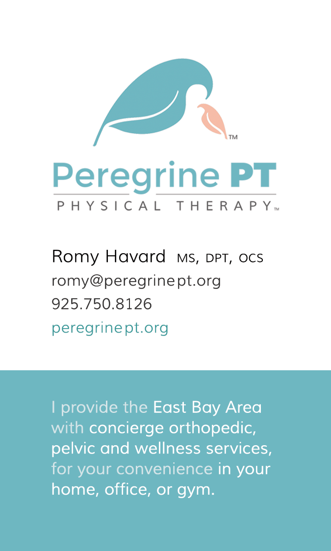
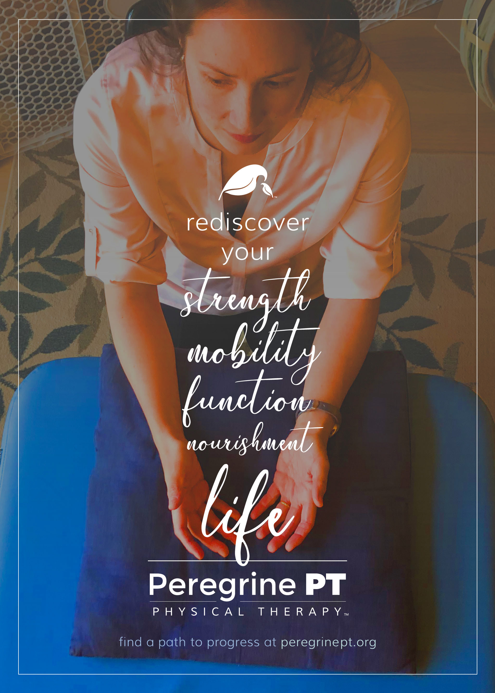
Peregrine Physical Therapy specializes in pregnancy and postpartum care, and so we worked on a number of logo ideas that played with the idea of mother + baby birds. We finally landed on presenting the birds as leaves, emphasizing the naturalness of physical therapy.
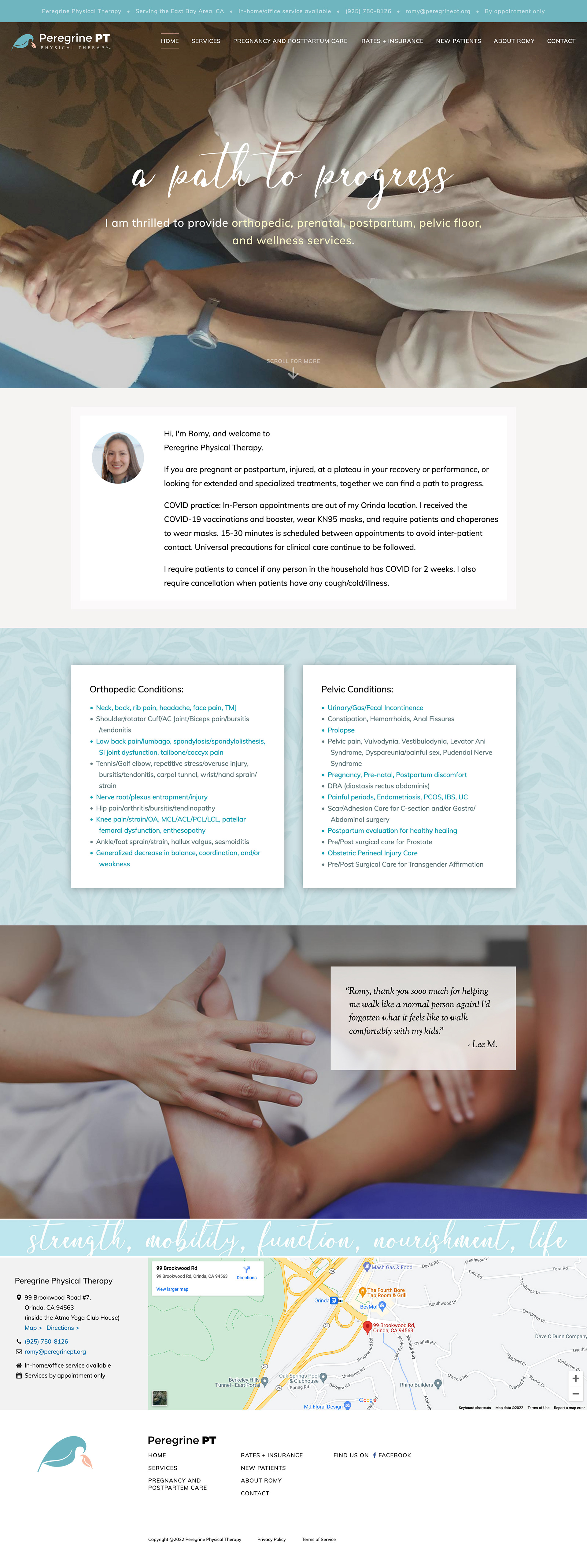
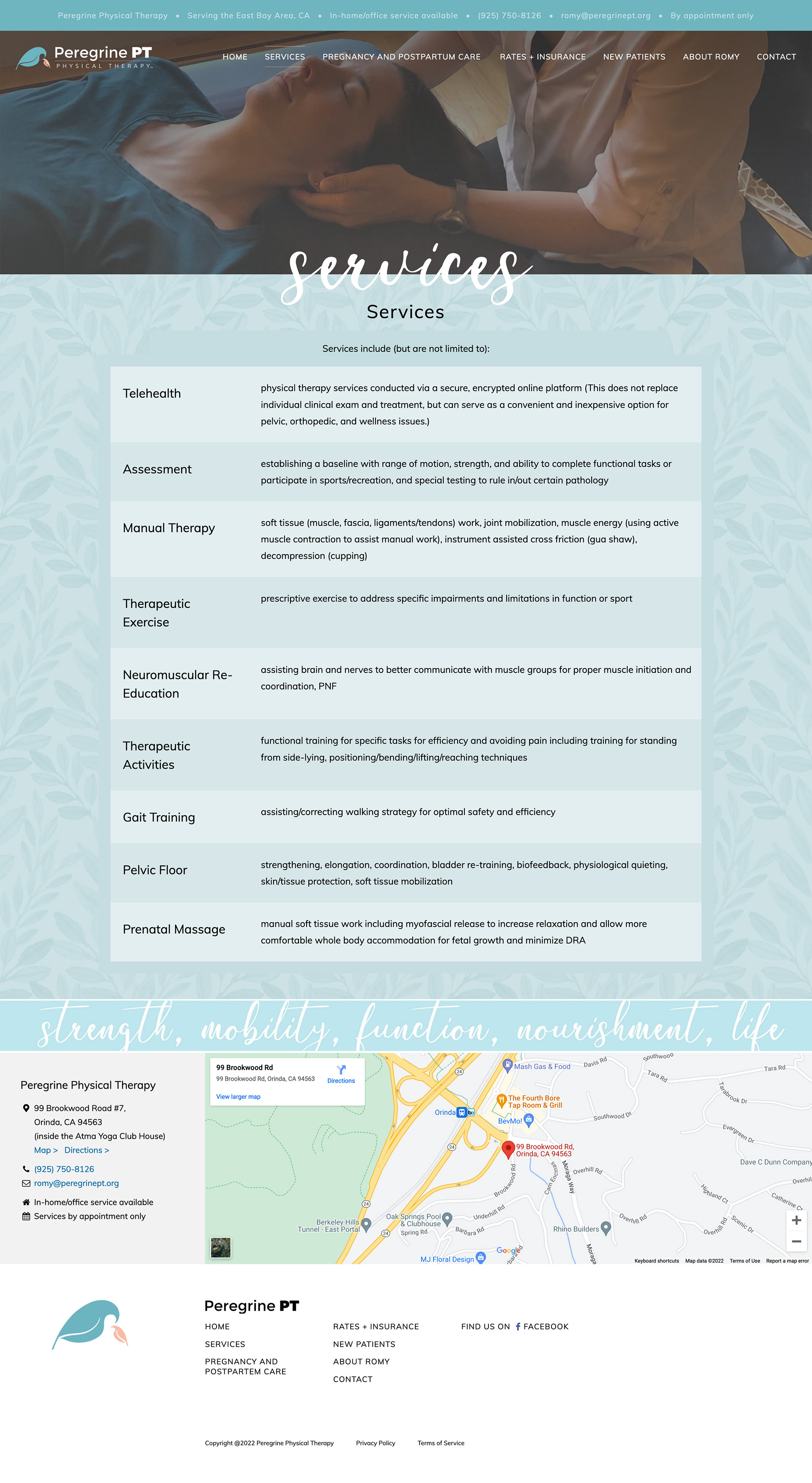
For her website, while many small business owners desperately want to appear much bigger and more corporate than they really are, Romy wanted something simple, personal, and beautiful. We chose a palette that was at turns warm and cool but always very natural, and mixed it with soft photography that conveyed the gentle but effective care you'd receive as a client. (I also made sure that the site worked just as well on mobile as it did on desktop, which, at the time, was a fairly novel idea.)
Romy's mentioned at every turn just how effective the site and brand have been for her, but I think that in this particular instance, her success is more a reflection of how wonderful and helpful she is to her clients.
