Companies that have been around a while tend to find themselves dealing with different flavors of design debt — frequently in the form of orphaned design styles spanning an ever-evolving website.
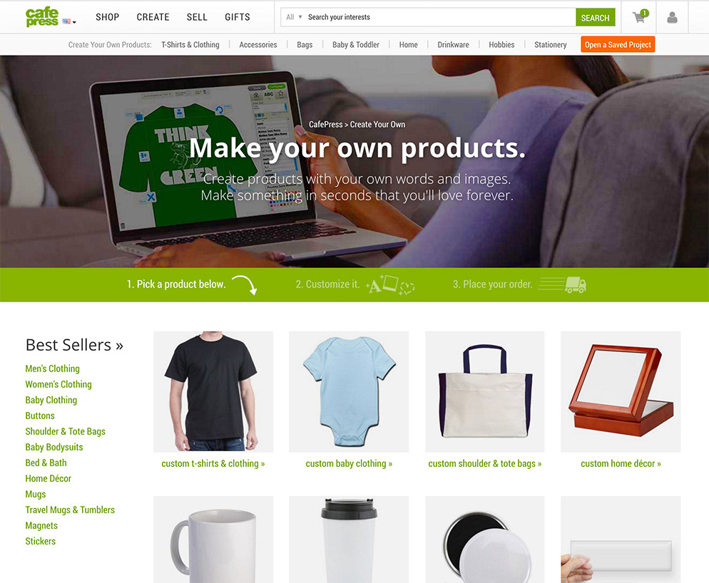
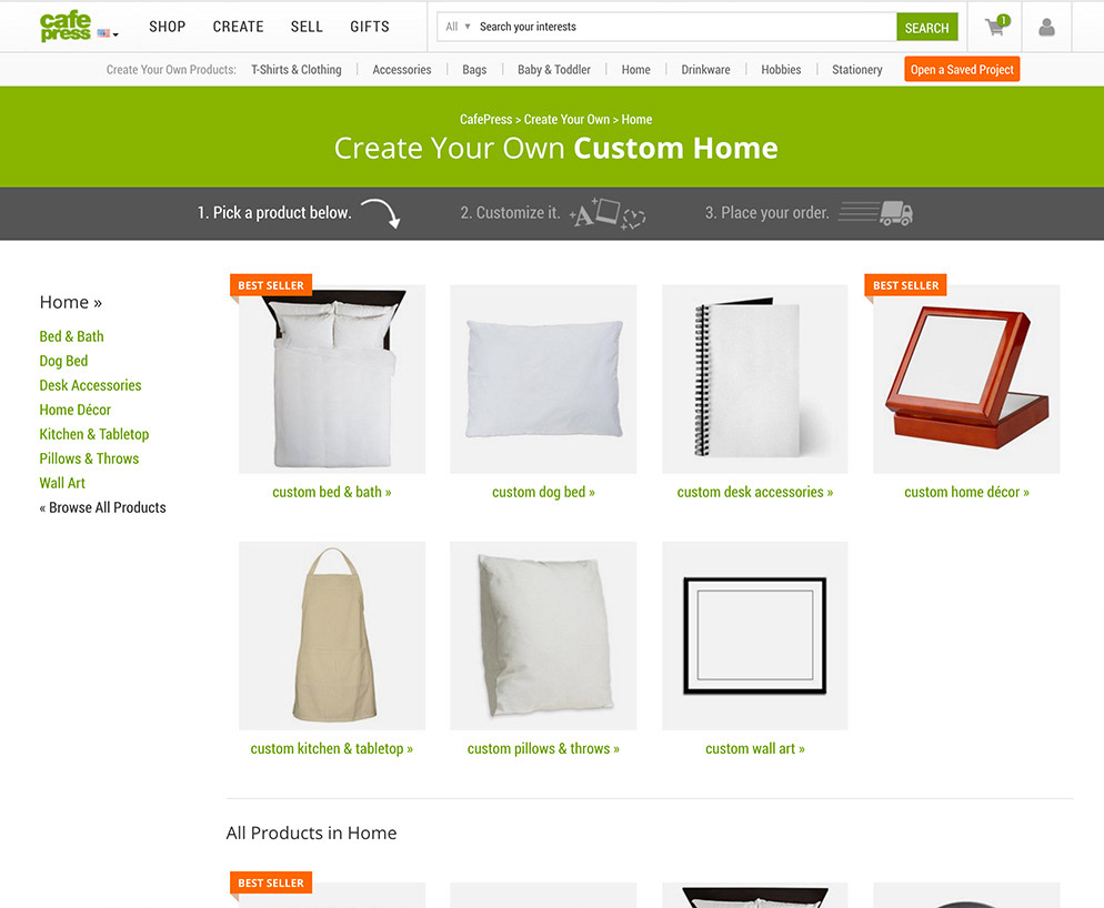
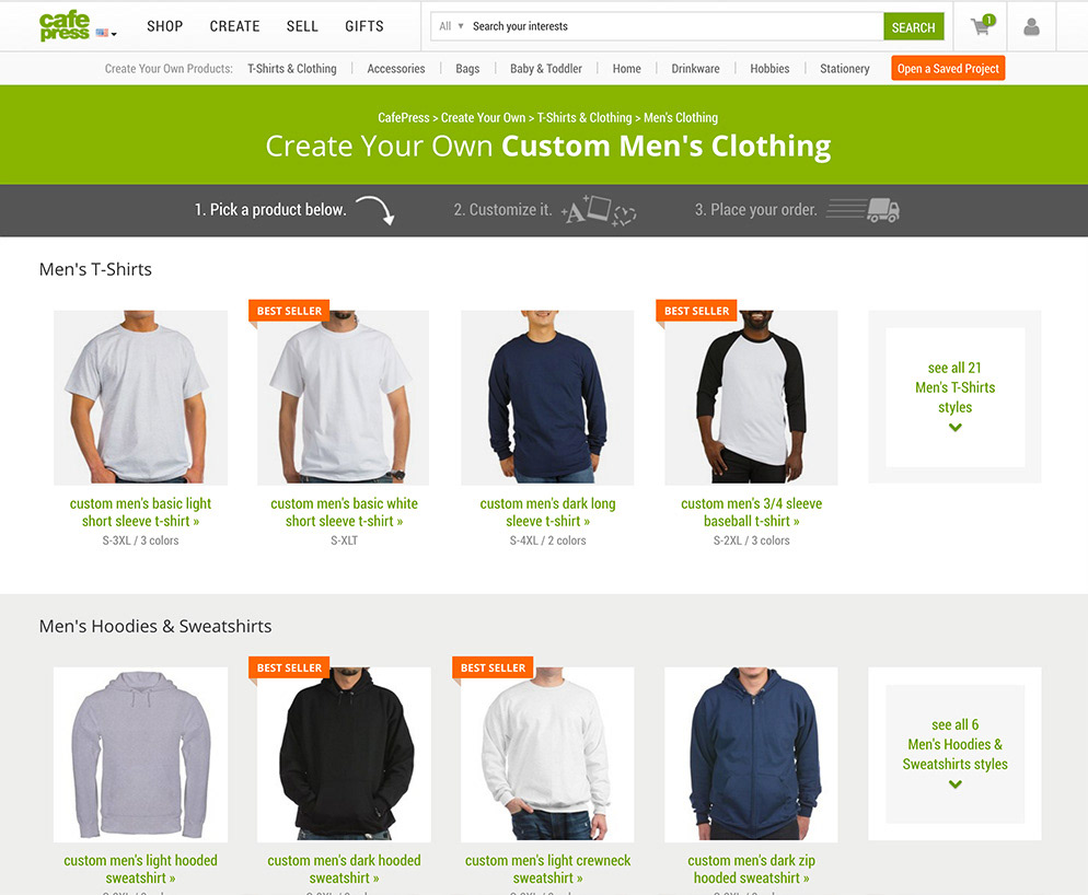
The Create & Buy section of CafePress had long since reached the worst form of multiplicity. Different C&B departments looked wildly different from each other, with styling, navigation, and flow changing completely from page to page.
My original project was to design a simple replacement, so that we could reset the look and feel, and start to iterate toward a higher converting experience. But we quickly ran into a huge blocker; staffing problems in Engineering meant no engineers to implement the designs, and because I was a contractor, I no longer had access to the backend.
But I did manage the javascript-based A/B testing platform, Qubit. So I built the Create & Buy system as a web app, and used Qubit to apply it as a 100% "test." It worked marvelously — so well that the test ran for over 2 years before Engineering had time to implement it the right way.
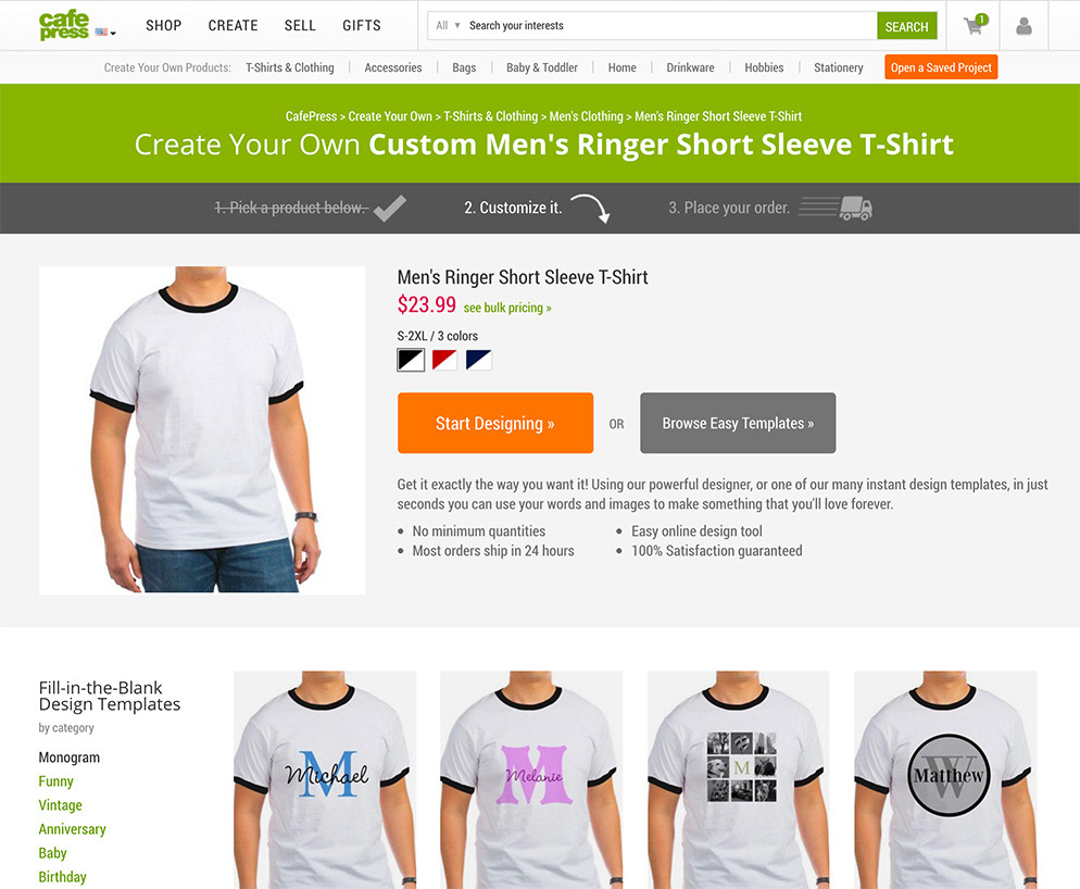
Over the coming months, I'd use the same technique to rebuild the homepage, search engine, marketplace departments, product category pages, product pages, the shopping cart, and checkout. For a time, one of the largest retail sites in the world (billions of URLs!) powered nearly their entire ecommerce site with A/B tests running at 100%.


